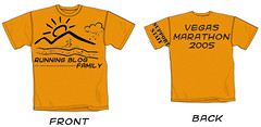
I don't care if you're headed to the Vegas Marathon or not or whether you're even a running or know any runners. What do you think of this proposed design? What works? What doesn't work? What should change, stay the same?
Email me if you'd like a higher res. image.
Subscribe to:
Post Comments (Atom)
4 comments:
I like the one posted on Wednesday better. It is more simple and less busy. The support staff on the sleeve is cool, but maybe in the same font as the front and back of the shirt. Very cool design however.
I emailed a friend in THE BUSINESS and she emailed me back with her suggestions and was also good enough to do a little photoshoppy shoppy herself. Before I paste in her comments, let me first plug her business. If any of you are high power captain of industry types, maybe you'll send some design work her way - go to:
her site
Anyway, here are the comments:
"ok, in my role as AD, I would respond thusly:
FRONT:
design is nice but way too big...bring it down so it doesnt run off to the side seams (and into the arm pits)
design also a bit busy...i'd remove the cloud and move the right downward slope of the mountain back to where the road takes a
downward jog
and then chop the road off there as well
reduce the size of your type (running blog family) on the front and put it all on one line centered beneath the design
move the url to the back of the shirt, but keep in mind, that url is WAY to complicated for anyone to remember so it's not giving
you any
advertising/traffic benefit and since it's not helpin gyou any, you might as well make it small an dnot worry about it
BACK:
Again i'd bring the size of the text down quite a bit, and spell out LAS next to Vegas so that your 2 lines of text almost line up
I'd take the "support staff" off the sleeve entirely unless you just love it
See what you get when you ask an art director for feedback?
Oh and i attached a couple of images to help illustrate...
cheers!
mt"
I agree with her on just about everything except possibly the support staff thing. Is it important that we retain someway for folks to optionally add a bit of printing that identifies whether they were running or supporting?
One last thing, I added her images to the ones I already had in flickr and created a group for them.
thank you 'friend in the business.'
i agree with just about everything she said too. it's too busy and i don't want to feel like i'm advertising something, even a blog (and even tho i'd like traffic to my blog). id propose making it a light, fun, simple shirt for runners and supporters alike to where. it may be clear whether you're a runner or a supporter by virtue of the fact that we will be running while they will not be. that said, again many thanks for moving the shirt thing along. it's gonna be neat and fun for us all to have matching shirts.
OK, what I'm hearing is
1. One shirt for everybody (my vote too)
2. keep it simple
3. Lose the web address.
4. and last but not least, keep it simple
Post a Comment