OK, Partyrunner's little sister spurred me on to further action, or further procrastination depending on your point of view.
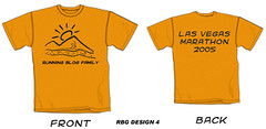
Things I changed since version 3:
1. Took off the support staff designation. Nobody seemed to care whether we designate the wearer as runner or support. I sure didn't.
2. Decreased the size of the front and back printing so as to stay out of the seems.
3. Added "Las" to "Las Vegas" on back
4. Lost the url
5. Cut the river and the mountain edge on the left back some and made the mountain edge swoop down by 13 degrees more to clockwise.
6. Cut some out of the bottom edge of the mountain as I thought it looked too thick compared to the river and complete runner guy.
I can always change things back or change them further, depending on the consensus. Whaddiya all think?
Also, I'm not married to the design we have. If any of you want to put forth alternates for consideration, I'd be all for it.
Also, also, I added designs 4 and 5 to the design photo set.
SD
Subscribe to:
Post Comments (Atom)
4 comments:
Uhm.
Yes Keith?
Hello to the little sister by the way. Thanks for your two cents worth. You're coming to Vegas, correct.
I like the cards and dice idea. Maybe we should make the text on the back of the shirt more vertical and put a small hand of cards at the upper left of the text and the dice at the lower right. The next time I'm in town I'll email myself the working image file so I can to a test proof of that.
I like the shirt designs. I was thinking the other day that someone should make a RBF t-shirt. Since you're doing one already for vegas--maybe you could do one for everybody else. ; )
Post a Comment